Protecting students’ cognitive energy
How I turned a cluttered EdTech platform into one that respects how students actually think, and grew monthly active learners by 66%.
A product full of value that was too tiring to use
SudoStudy helps 50,000+ students practise for exams. They showed up motivated and left drained: the platform offered everything at once, with nothing telling them where to begin.
As the only designer, working with a PM and two engineers, I owned the redesign end to end, from interviews and analytics through wireframes, testing and final UI. One rule guided every call: each decision had to protect a student’s mental energy, not spend it.
monthly active learners in the 12 weeks after launch.
screens needed to reach a task across core workflows.
first-session drop-off in the 30-day cohort.
Students were leaving before their first question
Almost a third of new users (31%) left without attempting a single practice question. They didn’t lack interest, and the product didn’t lack value. Getting to that value simply cost too much effort.
A learning labyrinth
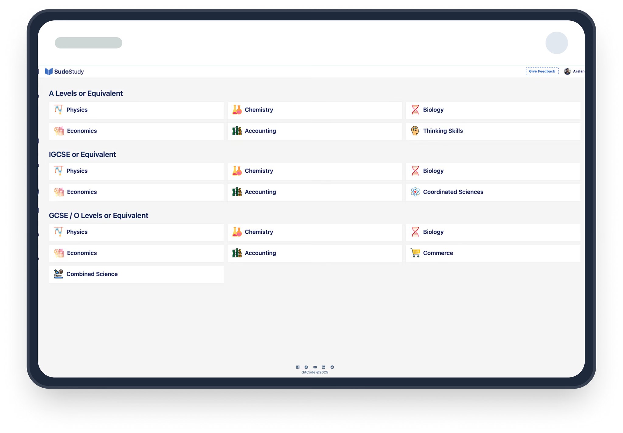
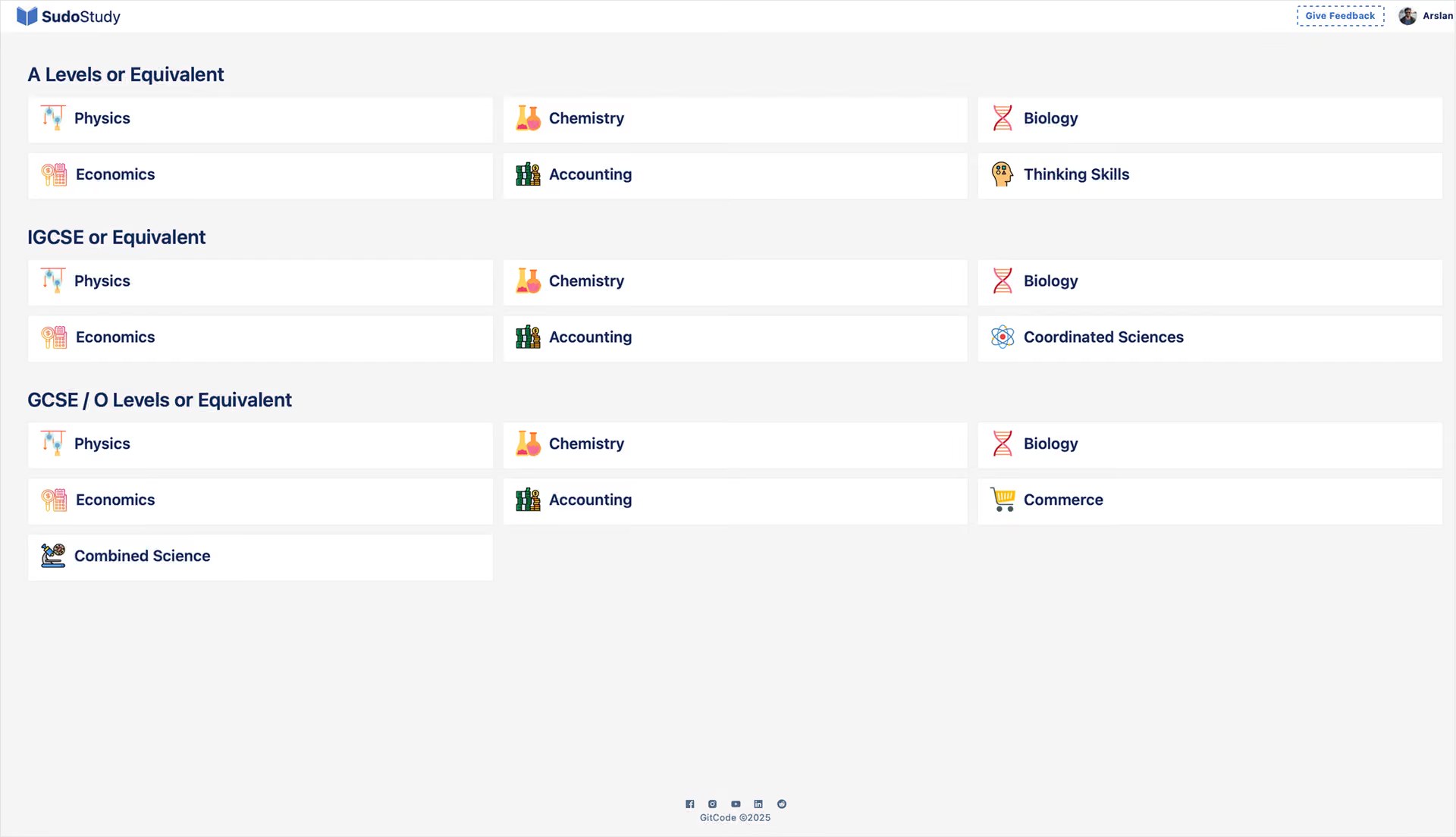
The dashboard laid every option out side by side: subjects, filters, reports and notifications. With no clear first step, students hit decision paralysis before any learning began, and many drifted around the dashboard and logged out.
I’d log in, scroll around, and log out. I didn’t even know where to start.SudoStudy student, research interview
Mapping where the energy went
I ran 12 interviews across three learning stages and 5 moderated usability tests, mapped 450+ drop-off points in PostHog over six weeks, and benchmarked three competing EdTech platforms. Three friction patterns kept coming back.
Decision paralysis
Every option appeared at once, so students overloaded before starting. 31% wandered the dashboard and left without opening a lesson.
The forgetting loop
Nothing showed progress, so every return felt like starting over. Without an unfinished task pulling them back, students finished modules and never came back.
Interface as bottleneck
Irrelevant buttons and alerts carried a hidden cost to ignore. In 34 of 48 sessions, students hesitated before touching the material at all.
Every time I came back, it felt like I was starting from scratch.SudoStudy student, research interview
We assumed students couldn’t find content. They found it fine. How might we stop draining them before they ever start?
Five overhauls, ordered by impact
Each change followed the same idea: take a decision away from the student wherever the product could make it for them.
One path into the product
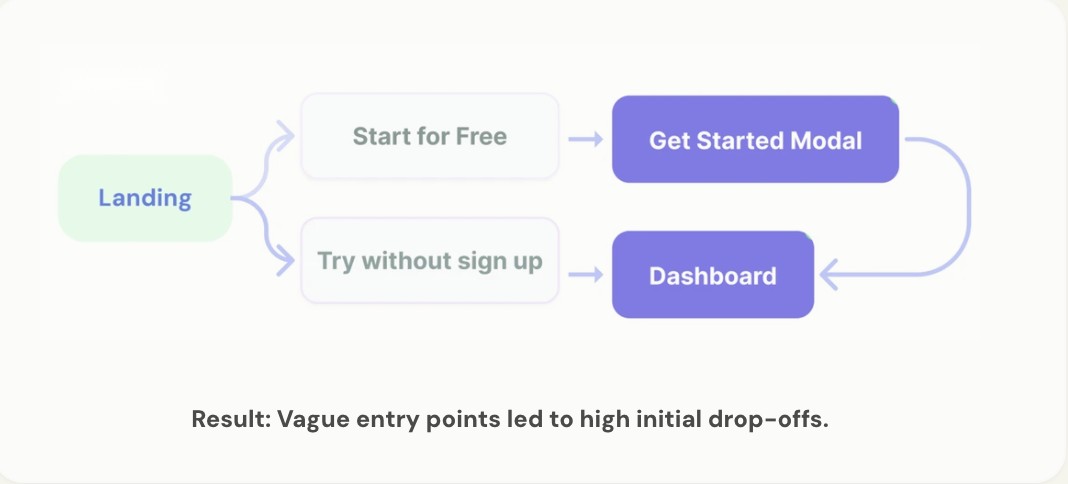
Sign-up used a two-path modal with competing buttons. I replaced it with a single linear flow: headline, email, password, start. The issue wasn’t how the choice was designed, but that there was a choice at all. In five tests, no one hesitated on the first screen, and first-session drop-off fell by 31%.
Route by intent, not content
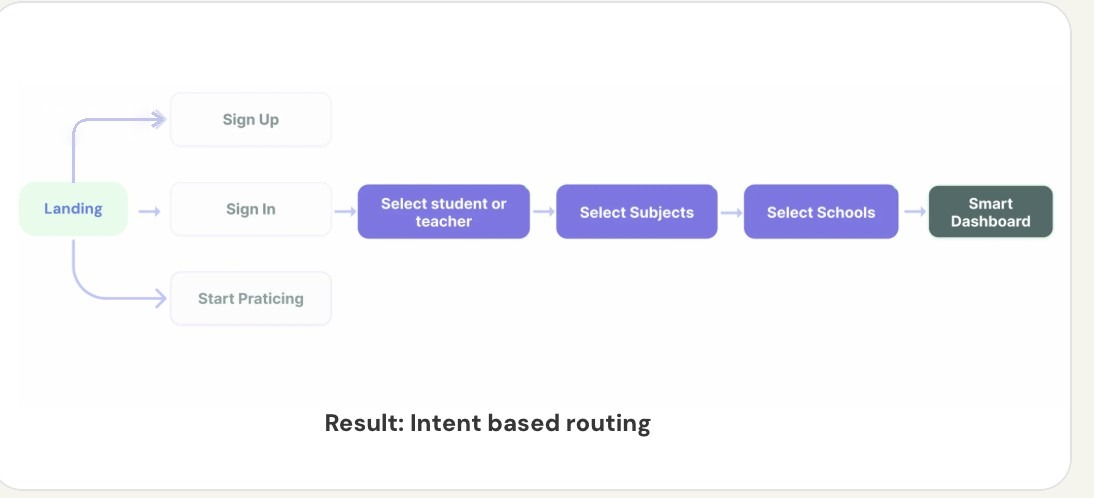
43% of users clicked through three or more irrelevant screens before their first task. A single question, “What are you here to do today?”, now sends them straight to the right place. My first version routed by content type, but testing showed students think in goals. First-session task completion rose 40%.
From a long list to a GPS
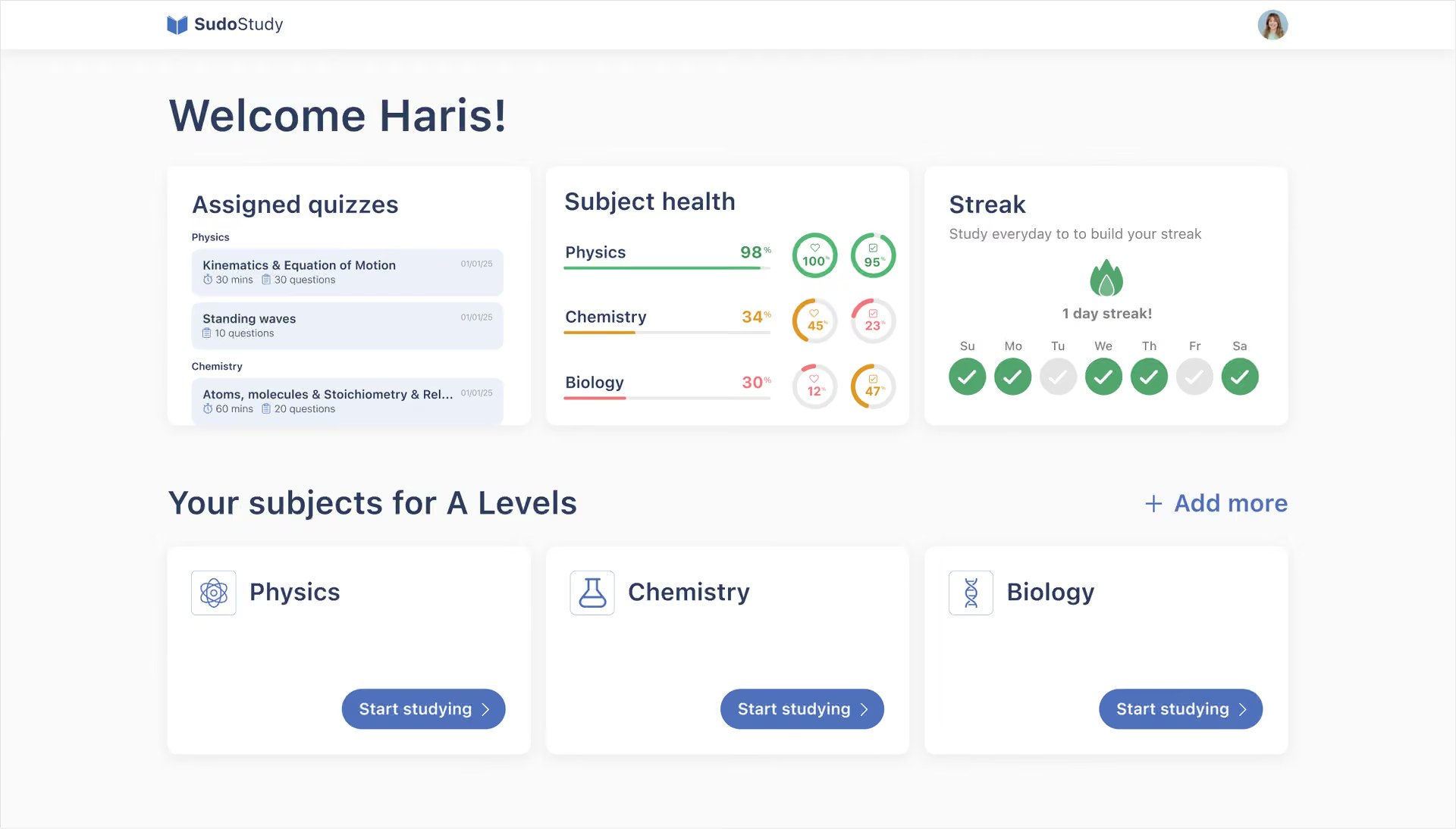
The dashboard became three answers side by side: what’s due, how am I doing, and am I keeping it up (assigned quizzes, colour-coded subject health and a streak). Each subject card has one action, “Start studying”. Students now reach a task in under two taps instead of four, and find tasks 27% faster.
Start practice from your weakest area
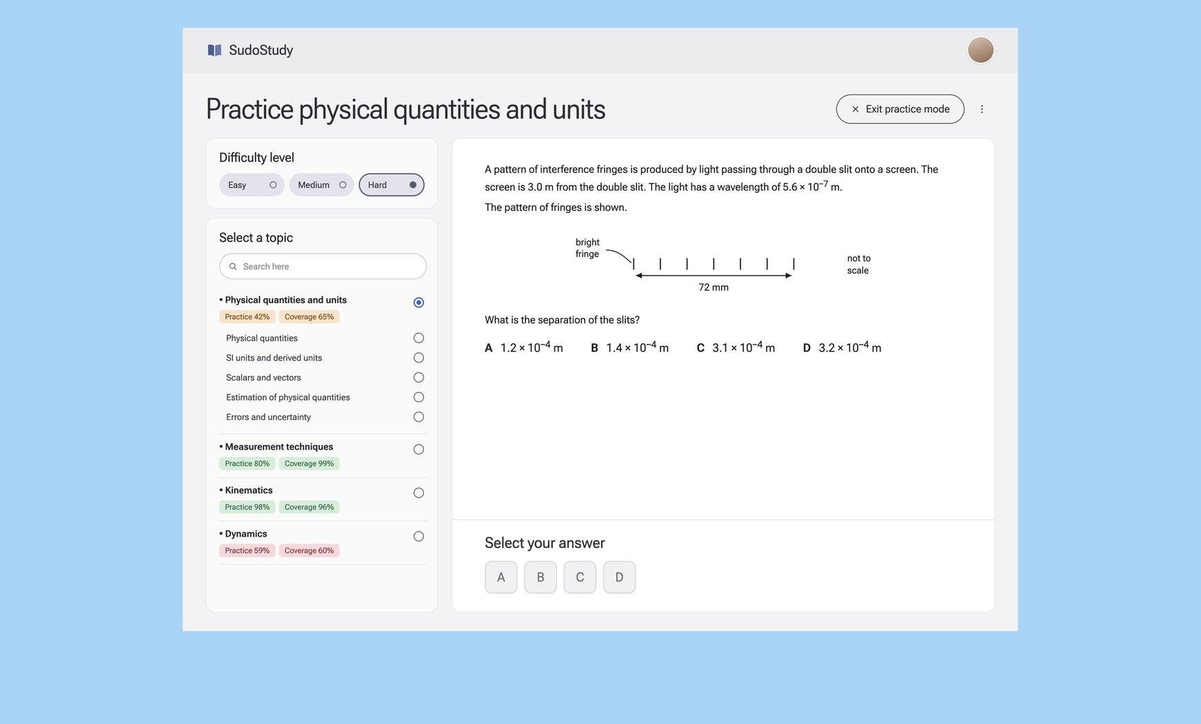
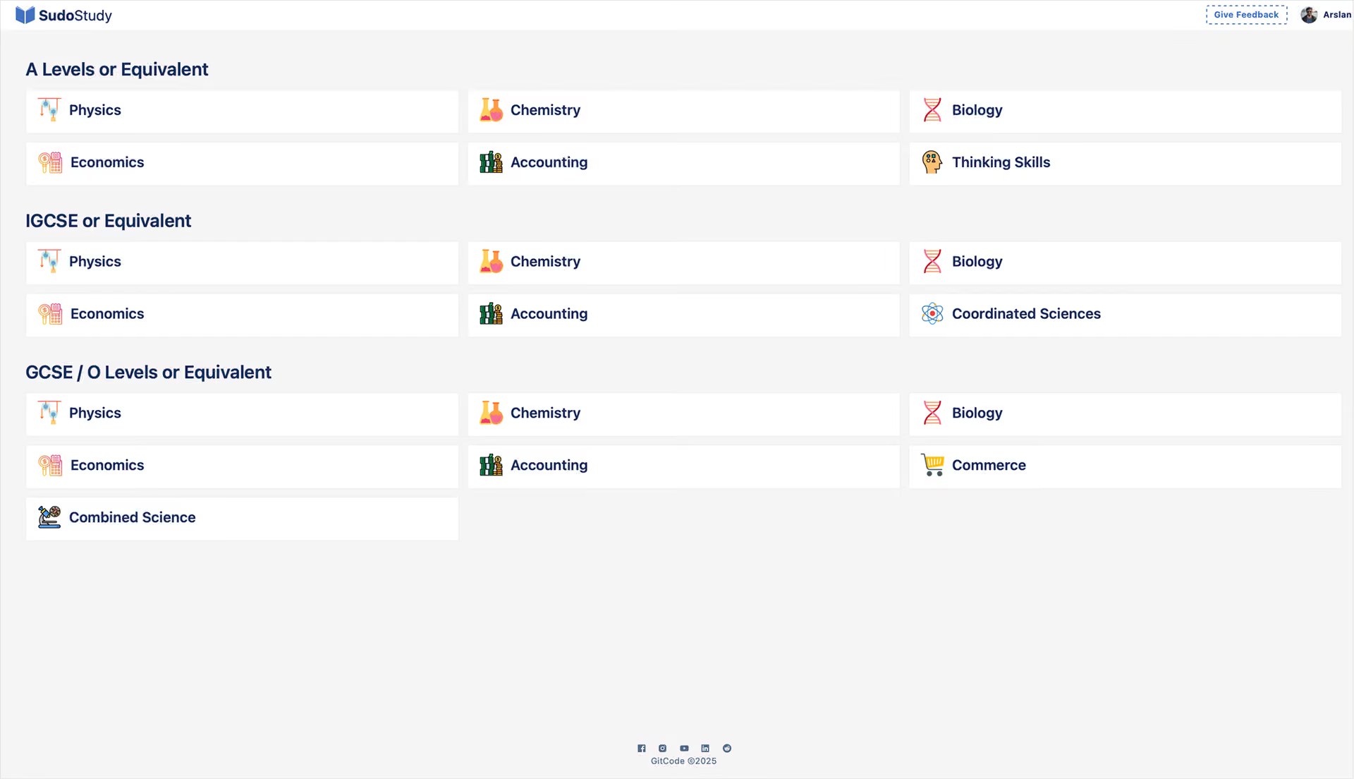
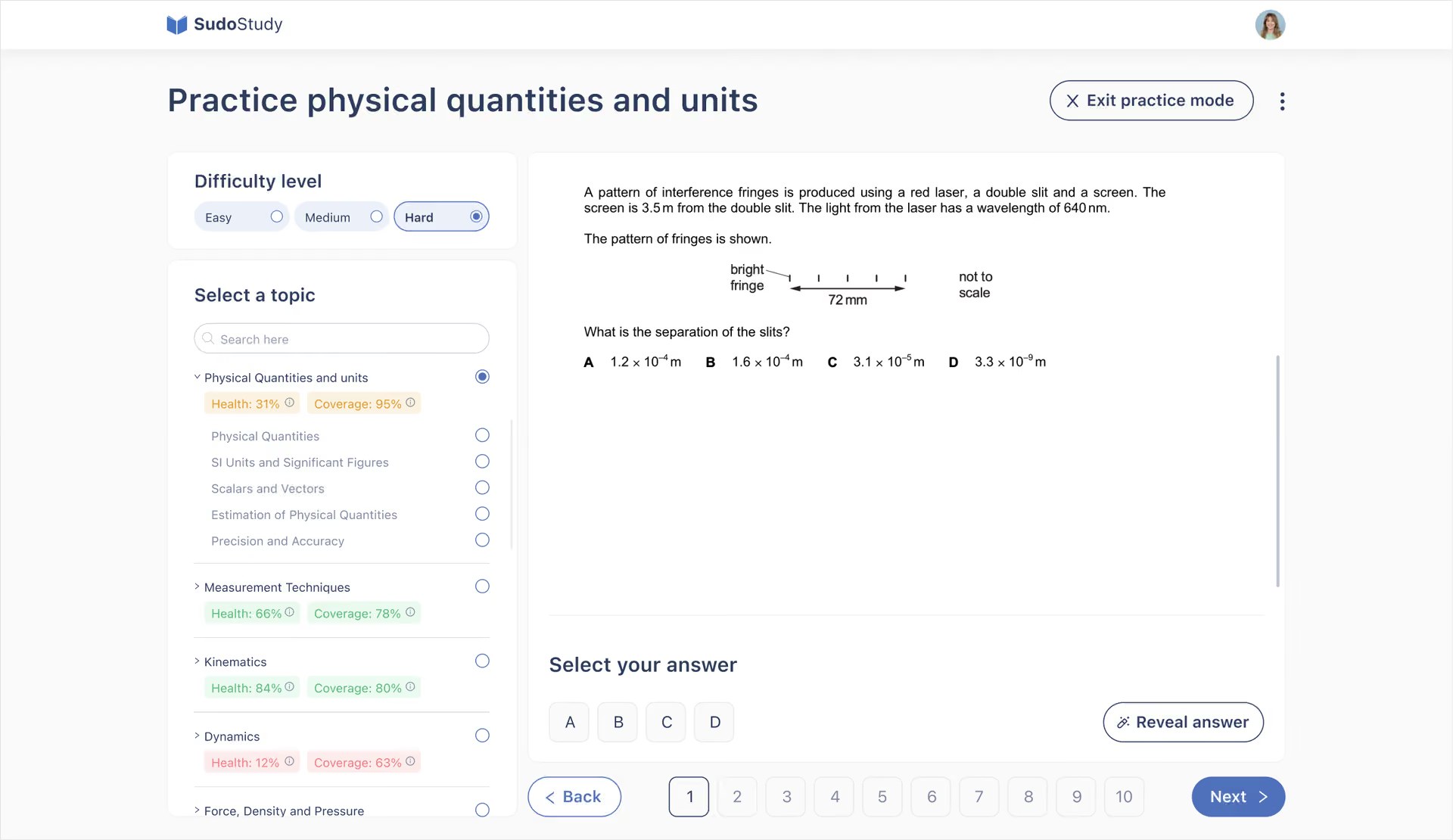
Practice used to start with manual setup: difficulty, year range, exam board and a stack of topics. Now it starts from your weakest area. The filter sidebar became a progress map with Health and Coverage scores, multi-select became single-select, and questions run in a numbered sequence with Back and Next. Sessions longer than 20 minutes rose 22%. Multi-topic practice is parked as a future advanced mode.
Five progress screens become one
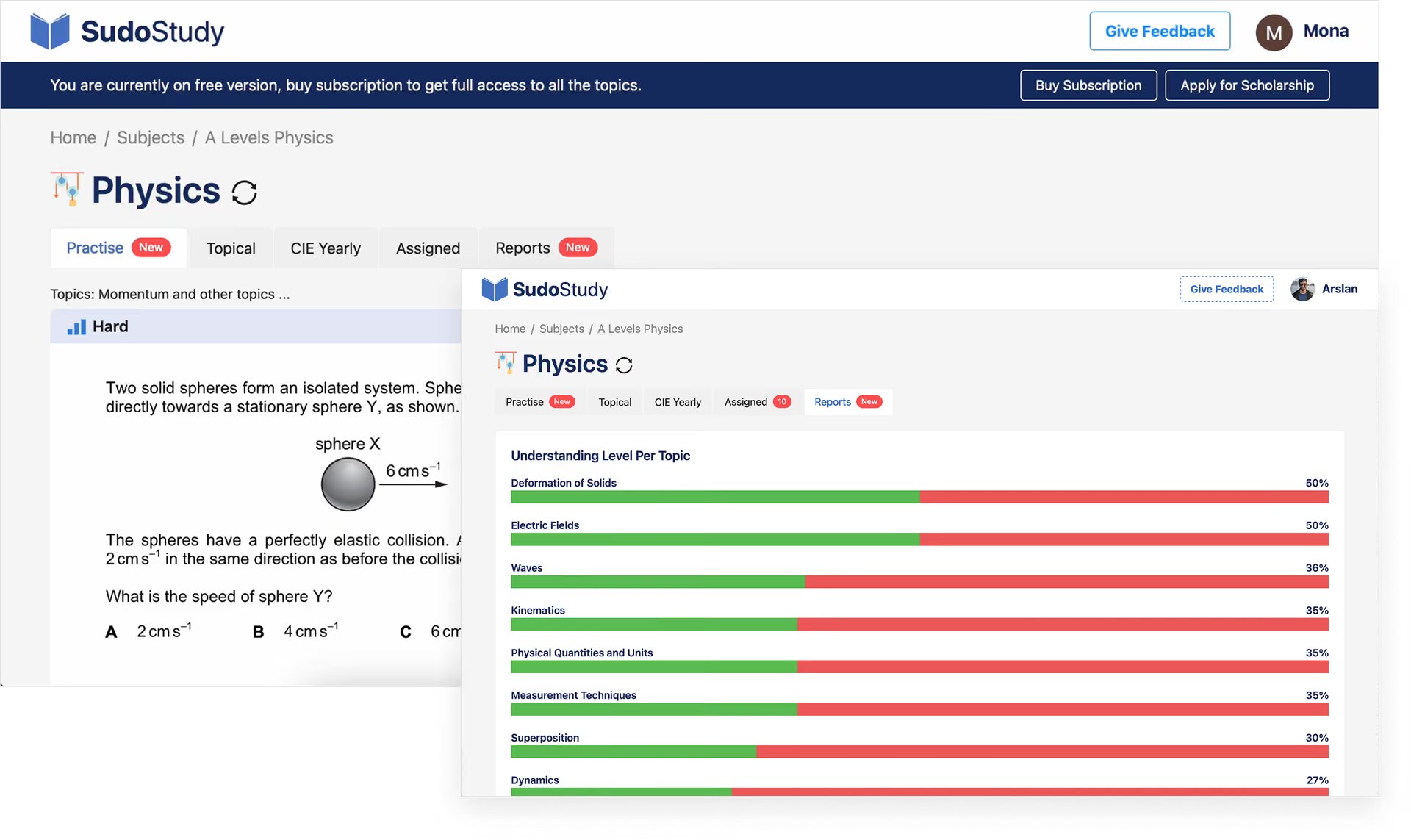
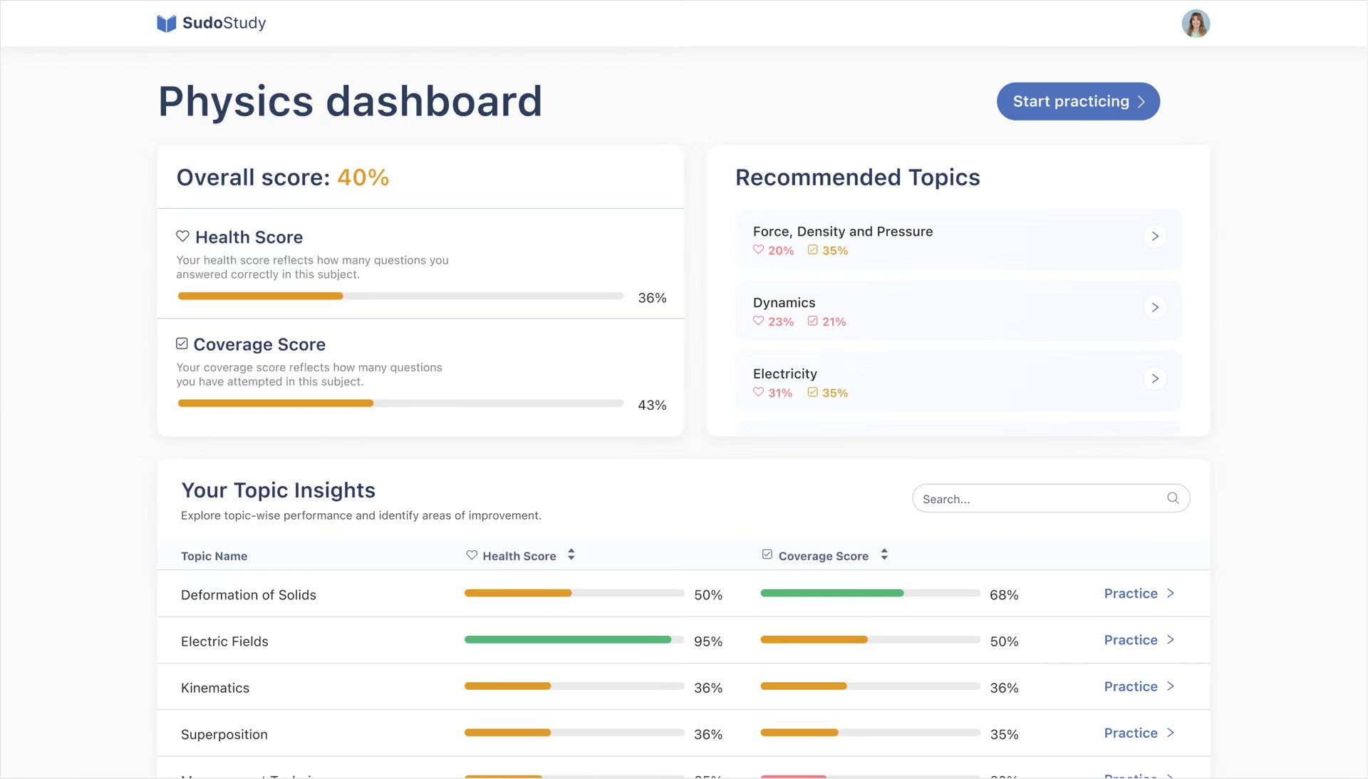
Students used to piece their progress together from five screens. One view now shows an overall score, Health and Coverage scores, and recommended topics you can practise in one tap. A difficulty filter I tried first was ignored, because students wanted relevance, not ranking. Cutting 30% of the UI made the remaining 70% work twice as hard. Detailed topic stats now sit in a scrollable table.
Small cuts that added up
The redesign shipped in March 2025 and still underpins the product. Fewer drop-offs, faster navigation and more return visits compounded into a 66% lift in engagement, as the platform grew from 50,000+ to 55,000+ students.
first-session task completion with intent-based routing.
practice sessions running longer than 20 minutes.
students on the platform after launch, up from 50k+.
What I’d carry forward
Test before you polish
I spent three weeks refining dashboard layouts before showing students anything. Both versions looked cleaner and neither mattered, because students wanted direction, not better organisation. Fast feedback beats high fidelity.
Protect attention, don’t compete for it
Most products fight for attention, but learning products have to guard it. Every feature costs some focus, and the best work on this project was what I took away.