Turning months of paperwork into minutes of clicks
Designing an online notary service that feels as trustworthy as sitting across a desk from a solicitor, and as quick as booking a taxi.
A legal service people only use when something is at stake
Nobody wakes up wanting a notary. People arrive at MyNotary mid-crisis: a property deal abroad, a visa deadline, a power of attorney for a parent. Traditionally that meant finding a notary, booking an office visit, posting originals and waiting weeks.
MyNotary does the whole thing online: upload, meet a certified UK notary on video, and receive a sealed, internationally recognised document. My job was to design an experience that earned trust in seconds and got people to a booked session without second-guessing.
average turnaround from session to delivered document.
countries where MyNotary’s seals are recognised.
per document, shown up front instead of “request a quote”.
Online felt risky for something this official
The service was fast, but speed alone doesn’t sell a legal act. For a first-time visitor, “notarised online” raises three questions at once: is this legally valid, is my data safe, and is there a real person on the other end?
Trust had to arrive before the ask
Most notary sites lead with forms and fees. Visitors hit a booking button before they understood what would happen, which service they needed or whether the result would hold up abroad. Every unanswered question was a reason to close the tab and call a local office instead.

People weren’t comparing us with other websites. They were comparing us with walking into an office and shaking someone’s hand.The framing that shaped the design
Three anxieties, in the order people feel them
Mapping the journey from search to booked session showed that doubts come in a predictable sequence. The page had to answer each one at the moment it came up, not all at once in an FAQ.
“Is this what I need?”
Visitors rarely know legal terms like certified copy, apostille or statutory declaration. They know their situation, not the service name.
“Will it be valid?”
Especially for documents going abroad, people need proof that a remote seal carries the same legal weight as an in-person one.
“Who will I be talking to?”
A faceless platform feels like a call centre. People wanted to know a qualified human would handle their documents.
How might we make an online legal service feel as certain as an office visit, before anyone has to hand over a document?
Show the process, prove the standard, introduce the people
Each section of the site answers one anxiety, in the same order visitors feel them.
A hero that shows the whole journey at a glance
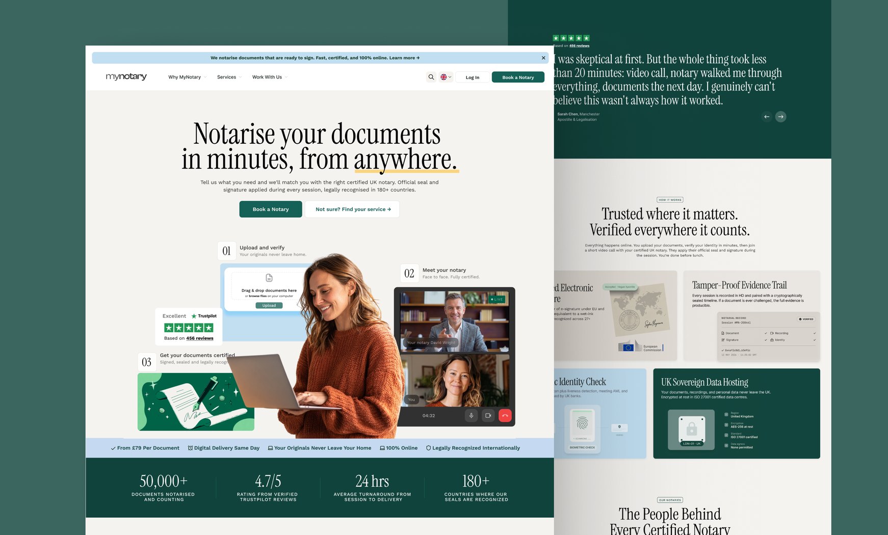
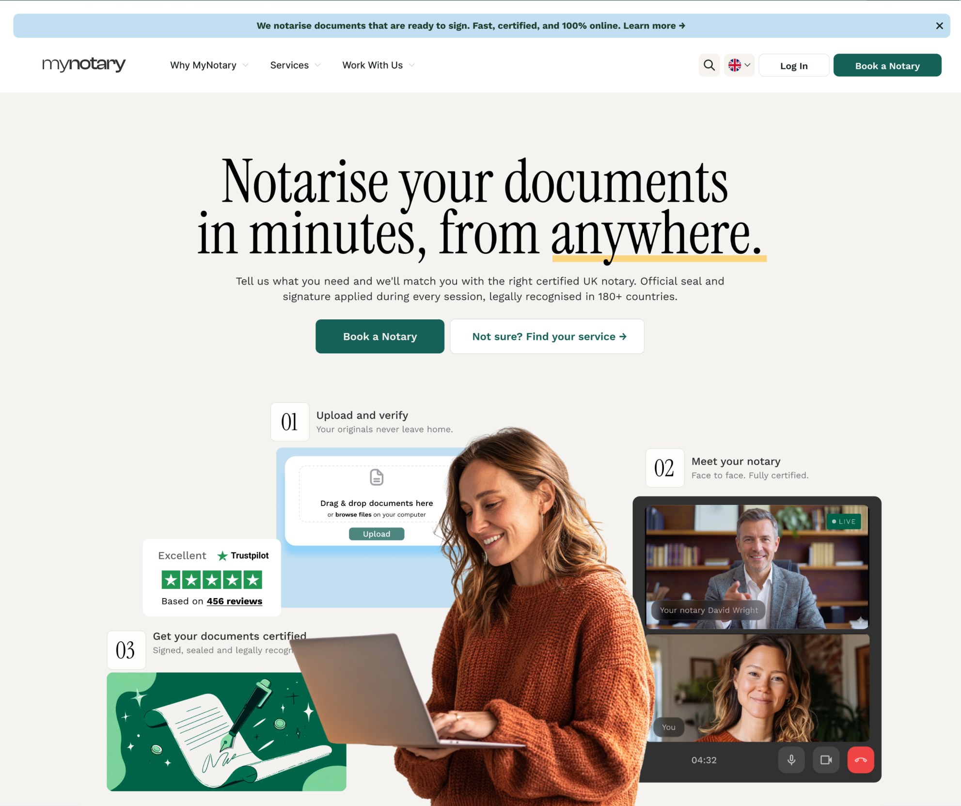
Instead of a stock photo and a slogan, the hero lays out the three steps as real interface: upload and verify, meet your notary on video, receive your certified document. A live-call mock-up with a named notary answers “is there a real person?” before the visitor even scrolls. Two calls to action serve both mindsets: “Book a Notary” for people who know, “Not sure? Find your service” for those who don’t.
Services named by situation, priced up front
Legal terminology was the first drop-off point, so each service card leads with plain language, like getting a certified copy or authorising someone to act for you, followed by the formal term. Every card shows its price and turnaround. Hiding the fee behind a quote form reads as “expensive and complicated”, while “from £79” reads as “this is routine”.
Proof of legitimacy, designed as product, not small print
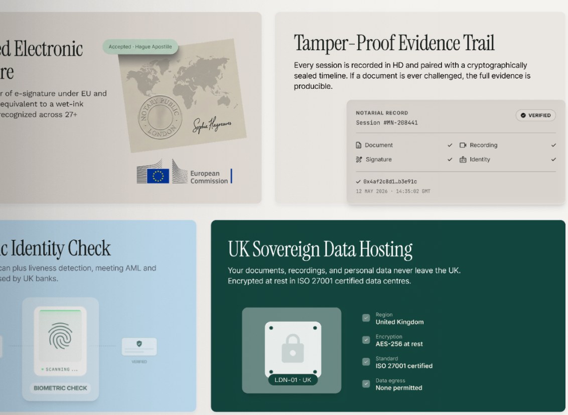
Compliance usually lives in a footer. Here it became a feature grid: qualified electronic signatures, a tamper-proof evidence trail, biometric identity checks and UK-only data hosting. Each tile visualises the safeguard (a sealed session record, a fingerprint scan, a server locked to London) so a visitor can see it working at a glance.
Put faces on the service
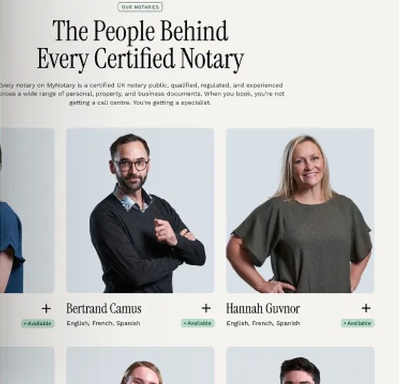
“The People Behind Every Certified Notary” introduces the notaries by name, with the languages they speak and live availability. It turns “a platform” into “someone I’d book”, and quietly handles the international case by showing who can help in French or Spanish.
Editorial type, calm palette
A condensed serif gives the brand the gravity of a legal document, and a deep green and soft blue palette avoids the aggressive reds and blacks of typical fintech. The effect is “established firm”, not “startup”. Serious enough to trust, warm enough to approach.
One page that walks a nervous visitor to a confident booking
The finished site follows the visitor’s thinking from top to bottom: what happens, what it costs, why it’s valid, who you’ll meet, and a closing call to book. Each scroll removes one objection before the next one forms.
Guided service finder
Plain-language service cards with visible pricing and turnaround.
Visible safeguards
Legal validity, identity checks and data hosting shown as product features.
Human-first booking
Named notaries, spoken languages and live availability before you book.
What I’d carry forward
Trust is sequenced, not stacked
Piling every badge and guarantee above the fold reads as over-selling. Answering each doubt at the moment it appears feels like being looked after.
Compliance can be a selling point
The safeguards that legal teams insist on are exactly what anxious customers want to see. Designing them as features, not fine print, turned a requirement into a reason to book.