Turning silent revenue leaks into recovered dollars
Redesigning an AI contract-audit platform so finance teams stop cleaning data and start protecting revenue.
The data and the AI were there. The interface buried both.
TrustedIQ audits CRM records against signed contracts to catch the quiet errors that erode deal value: mismatched billing terms, wrong start dates, incorrect amounts. The detection worked. But finance teams were still auditing row by row, and most of their time went to discrepancies that didn’t cost anything.
As the only designer, working with one engineer and the founding team, I owned research, UX strategy, interface design and testing. The brief I set myself: turn a powerful but clunky audit tool into something finance teams want to open every morning.
minutes to verify a contract, now in a single view instead of across tabs.
AI adoption once the product showed why it flagged each mismatch.
of contract value made visible to leadership in one place.
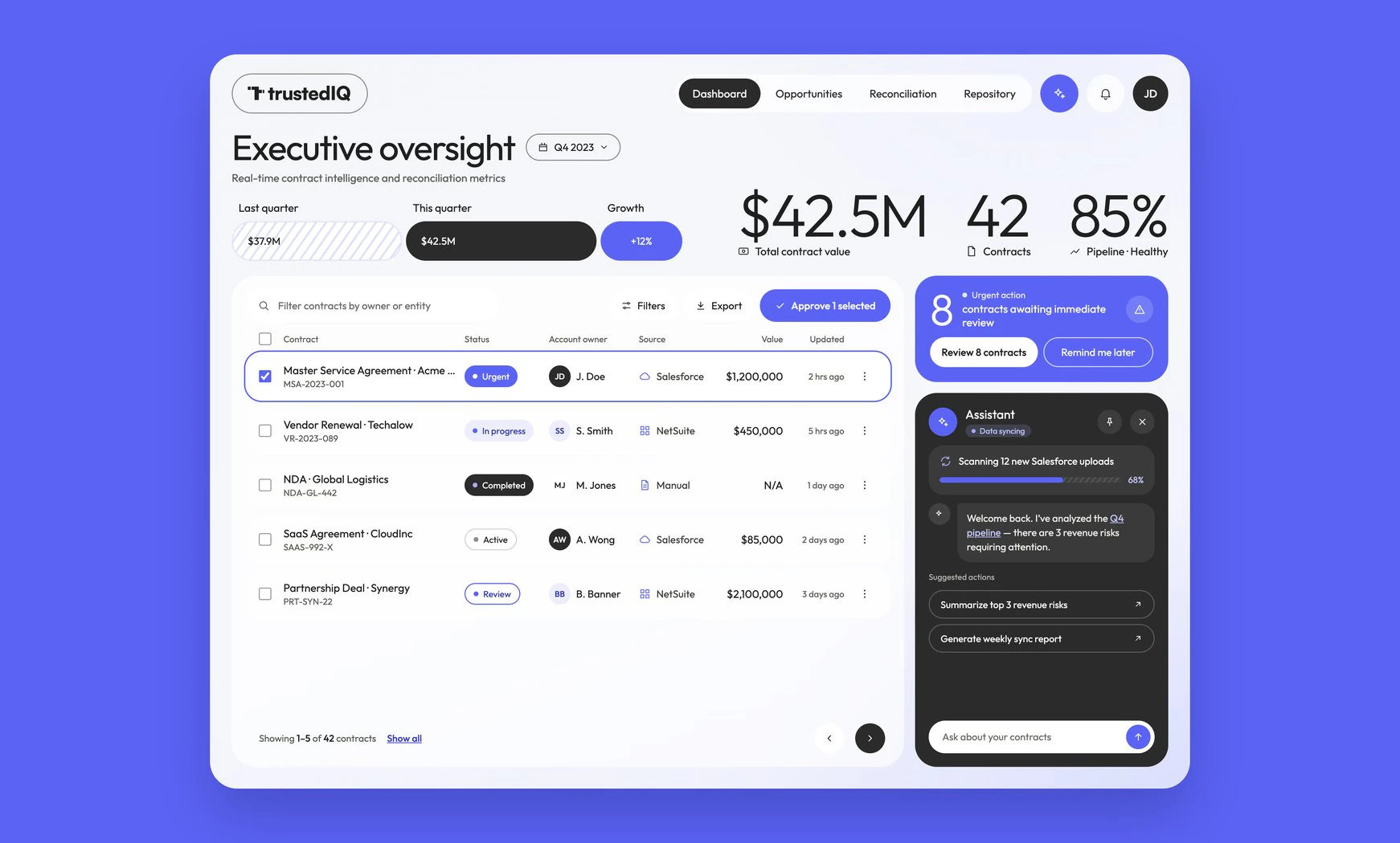
$42.5M at risk, and nobody could see it
Everything was flat. Leadership saw fragments instead of a picture. Analysts faced hundreds of flagged fields with no way to tell a $50 postcode typo from a $10,000 billing error. So 32% of conflicts were simply ignored, not out of carelessness, but because nothing on screen said one row mattered more than another.
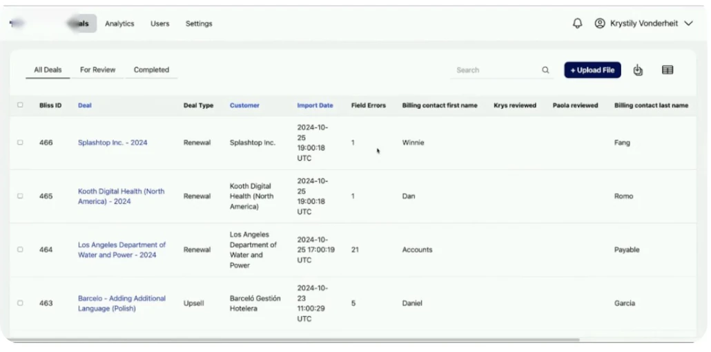
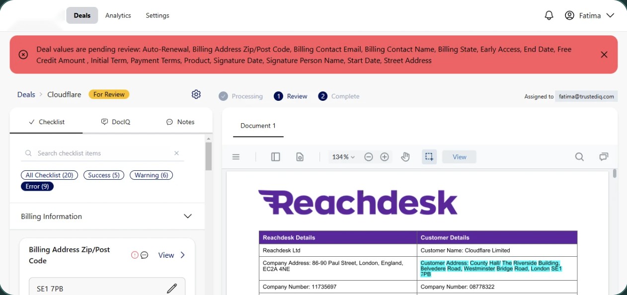
I don’t need to know the status of every billing contact. I need to know if we’re leaking money.Finance executive, research interview
Three failures, one root: the product was built for data, not decisions
I watched analysts audit real contracts and interviewed the executives who were supposed to act on the results. The friction clustered into three patterns.
Context switching killed accuracy
One contract took about 12 minutes. Analysts held a date or billing term in their heads while tabbing between the CRM and a 14-page PDF. Every switch reset their focus, and complex contracts were abandoned.
Flat lists hid the big risks
A $1M partnership looked identical to a $1,000 renewal. Users spent around 80% of their time on low-value fixes because the interface couldn’t tell them what mattered.
Executives avoided the product
Leaders didn’t want row-level audit data. They wanted pipeline health at a glance. The screen was full of metadata for the process, and none of it told the financial story.
Finding a single error in the legacy product
Steps that caused drop-off or errors
Stop asking “is this record clean?” How might we answer “how much is this costing us?” on every screen?
From manual auditing to impact-led resolution
I rebuilt the product around financial impact: the costliest discrepancy surfaces first, and fixing it happens in one pane. The narrative moved from “fixing errors” to “protecting revenue”.
A command center, not a deal list
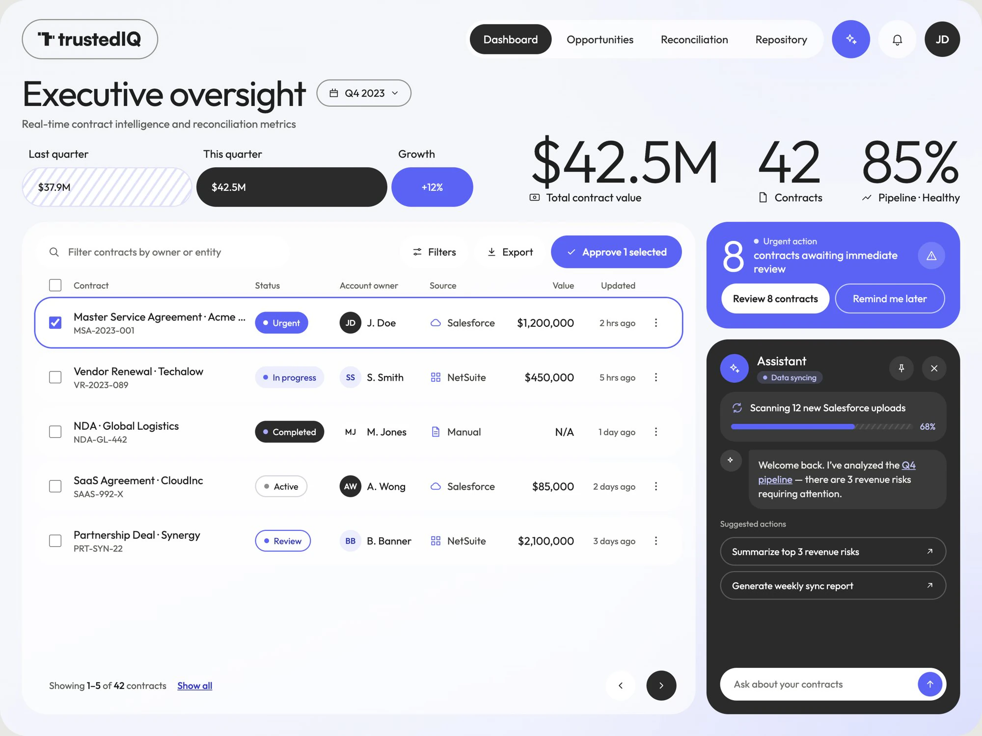
Executives open to three numbers that tell the story: total contract value, contract count and pipeline health, with quarter-on-quarter growth beside them. An urgent-action card pulls the eight contracts that need a decision to the top. Status badges and deal values replace columns of billing contacts. An AI assistant sits alongside, summarising revenue risks and generating reports on request.
Triage by financial gravity
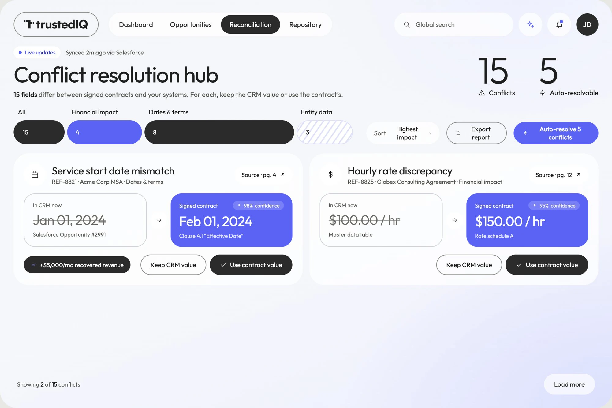
The Conflict Resolution Hub gathers every discrepancy across the organisation, sorted by highest impact and filterable by financial, dates and terms, or entity data. Each card shows the stakes (“+$5,000/mo recovered revenue”) and puts the CRM value next to the contract value, with the AI’s confidence score and the source page. High-confidence matches can be auto-resolved in bulk.
My first version ranked by dollar amount alone. Testing showed timing matters too: a $5,000 error renewing next week beats a $50,000 error renewing in six months. I added a time-urgency layer to the ranking.
One pane: document, conflicts, verdict
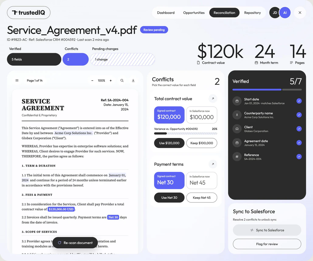
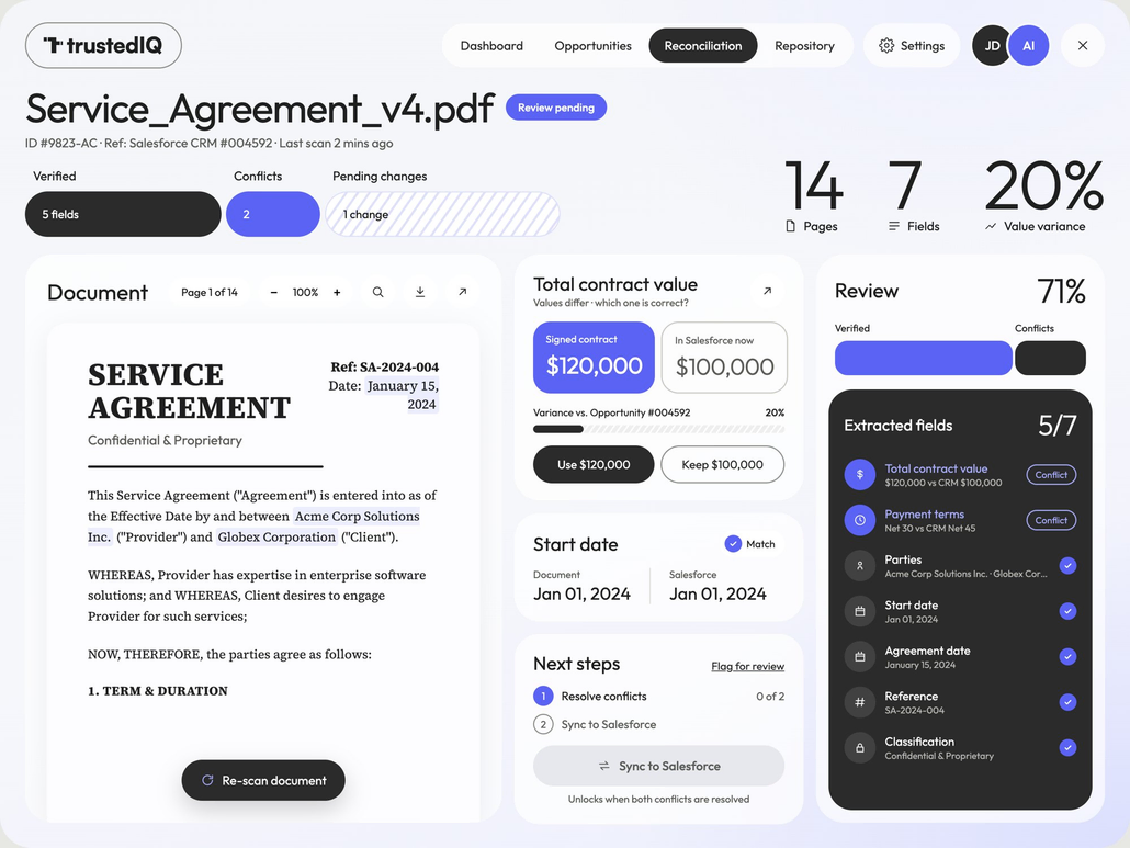
The split view puts the contract on the left with extracted values highlighted in place, the conflicts in the middle as “signed contract vs. Salesforce now” choices, and verification progress on the right. Nobody has to hold a number in their head. Syncing to Salesforce stays locked until every conflict is resolved, so bad data can’t slip through.
Make the AI explain itself
The AI had been in the product from day one, but people didn’t use it because they didn’t understand it. Every suggestion now shows its reasoning: a confidence score, the clause it read and a link to the exact page. Showing why the AI flagged something is what drove a 72% increase in adoption.
From auditor to decision-maker
What took 12 minutes across several tabs now takes under 2 in one view: document on the left, CRM on the right, conflicts flagged live, one-click sync to Salesforce.
What changed
What I’d carry forward
Curation is the product
The old dashboard showed more information and was less useful. In data-heavy tools, the job is deciding what deserves attention and what should disappear.
Finance thinks in risk, not records
Nobody wanted clean data for its own sake. Once I reframed around what dirty data costs, every design decision got easier.
Nobody trusts a black box
A capable AI nobody understands is an unused AI. Visible reasoning turned it from a feature into something people rely on.